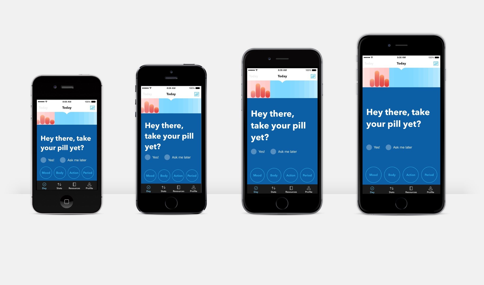
Tôi đã trải qua việc đưa ý tưởng thiết kế ứng dụng của người thiết kế lên thiết bị, nó không dễ như các bạn nghĩ, thông thường bản thiết kế của họ chỉ dựa trên một size điện thoại chuẩn vi dụ iphone 6 ~4.7 inches. Như vậy nhiệm vụ của tôi là thiết kế giao diện trên điện thoại làm sao cho nó không những đẹp nhất trên điện thoại 5 inches mà còn phải tính toán để cho nó cũng có thể nhìn đẹp trên iphone 6 plus 5.5 inches, iphone se 4 inches hay thậm chí phải hiển thị đẹp trên máy tính bảng.
Mới bước vô nghề dev này chưa có nhiều kinh nghiệm nên tôi phải... tất cả làm bằng tay và chạy thử  . Công việc rất tốn thời gian, nhất là nếu bạn viết ứng dụng chạy trên hai nền tảng iOS và android cùng lúc. Và cũng chưa chắc là thử hết trên tất cả. Về kỷ thuật thì tương tự như nhau nếu viết trên platform của iOS (Swift, Objective C) hay trên android (java). Tôi dùng React Native (javascript, jsx) để giải thích.
Khi có bản thiết kế giao diện sử dụng pixel để dựng ra (trên sketch...), ví dụ như cái nút (button) này trên 4.7 inches là 100 pixel thì trên điện thoại khác chút, gọi là dp (density-independent pixels). Cái dp này không phải là độ phân giải của màn hình điện thoại mà là điểm trên điện thoại (độc lập với độ phân giải pixel, 1 dp có thể có nhiều pixel). ví dụ iphone 7 có 375 dp chiều ngang và 667dp chiều dọc và có độ phân giải full HD (1920x1080). Nói tóm lại, thiết bị càng lớn càng nhiều dp. Điều này tương tự cho các điện thoại, tablet hiện nay.
Phần code demo
Quay trở lại React Native, tôi có đoạn code sau:
/**
 * Sample React Native App
 * https://github.com/facebook/react-native
 * @flow
 */

import React, {Component} from 'react';
import {
    Platform,
    StyleSheet,
    Text, TouchableOpacity,
    View, Dimensions
} from 'react-native';

const instructions = Platform.select({
    ios: 'Press Cmd+R to reload,\n' +
    'Cmd+D or shake for dev menu',
    android: 'Double tap R on your keyboard to reload,\n' +
    'Shake or press menu button for dev menu',
});

type Props = {};
export default class App extends Component<Props> {
    render() {
        return (
            <View style={styles.container}>
                <View style={{flexDirection: 'row'}}>
                    <View style={{flex: 8.5}}/>
                    <View style={[styles.box, {flex: 83}]}>
                        <Text style={styles.title}>React Native is Awesome</Text>
                        <Text style={styles.text}>Là chương trình phần mềm trên điện thoại di động được viết dựa trên
                            nền
                            tảng web (html5, css3, javascript), bản chất hoàn toàn là ứng dụng web nhưng có thêm được
                            các
                            tính năng thao tác phần hệ điều hành như tập tin, truy cập máy ảnh, GPS hoặc các cảm biến
                            như
                            con quay hồi chuyển, gia tốc kế…Toàn bộ những thứ này đều được bao bọc bởi một lớp ứng dụng
                            Native mà nổi bật là Phonegap/Cordova.</Text>
                        <View style={styles.buttonsContainer}>
                            <TouchableOpacity style={styles.button}>
                                <Text style={styles.buttonText}>Accept</Text>
                            </TouchableOpacity>
                            <TouchableOpacity style={styles.button}>
                                <Text style={styles.buttonText}>Decline</Text>
                            </TouchableOpacity>
                        </View>
                    </View>
                    <View style={{flex: 8.5}}/>
                </View>
            </View>
        );
    }
}

const {height, width} = Dimensions.get('window');


const styles = StyleSheet.create({
    container: {
        flex: 1,
        backgroundColor: '#E0E0E0',
        alignItems: 'center',
        justifyContent: 'center',
    },
    box: {
        width: 300,
        height: 450,
        backgroundColor: 'white',
        borderRadius: 10,
        padding: 10,
        shadowColor: 'black',
        shadowOpacity: 0.5,
        shadowRadius: 3,
        shadowOffset: {
            height: 0,
            width: 0
        },
        elevation: 2
    },
    title: {
        textAlign: 'center',
        fontSize: 20,
        fontWeight: 'bold',
        marginBottom: 10,
        color: 'black'
    },
    text: {
        textAlign: 'center',
        fontSize: 14,
        color: 'black',
        lineHeight: 25
    },
    buttonsContainer: {
        flex: 1,
        justifyContent: 'flex-end',
        alignItems: 'center'
    },
    button: {
        width: 150,
        height: 45,
        borderRadius: 100,
        marginBottom: 10,
        backgroundColor: '#41B6E6',
        alignItems: 'center',
        justifyContent: 'center',
    },
    buttonText: {
        fontWeight: 'bold',
        fontSize: 14,
        color: 'white'
    }
});
và kết quả khi chay đoạn code:


Chúng ta thấy đoạn code chỉ tối ưu nhìn đẹp trên điện thoại Nexus5x 5.2 inches. Bên phần tablet thì chỉ có hiển thị ui ra nhưng với tỉ lệ không hợp lý. Để giải quyết vấn đề này trên React Native, có nhiều cách nhưng có 3 cách sau đây tôi thấy hiệu quả nhất.
Dùng thuộc tính flex
Flex trên React Native về cơ bản cũng tương tự như thuộc tính flex trên css. Khi chúng ta viết một thành phần nào đó mà cần phải co giản theo size một cách tự động. Để app dụng flex, chúng ta để ý thấy phần message box có width:300. Trong khi đó emulator của tôi có dp là 360x592, chiếm khoảng ~83% (300/360) chiều ngang của màn hình, ~8.5% margin bện trái , ~8.5% margin bên phải. Để margin bện trái và phải, chúng ta thêm 3 component vào. Đoạn code sẽ được thêm vào sử dụng inline style trên component cho dễ nhìn. Chúng ta có phần màu xanh là một component có thuộc tính style là flexDirection:'row' có nghĩa là các component con của nó sẽ được xếp và co giản theo chiều ngang. Phần màu vàng và đỏ là 2 component View mình thêm vào đóng vai trò là margin left và right có chiều rộng là 8.5% phần còn lại là messagebox với chiều rông là 83%.
/**
 * Sample React Native App
 * https://github.com/facebook/react-native
 * @flow
 */

import React, {Component} from 'react';
import {
    Platform,
    StyleSheet,
    Text, TouchableOpacity,
    View
} from 'react-native';

const instructions = Platform.select({
    ios: 'Press Cmd+R to reload,\n' +
    'Cmd+D or shake for dev menu',
    android: 'Double tap R on your keyboard to reload,\n' +
    'Shake or press menu button for dev menu',
});

type Props = {};
export default class App extends Component<Props> {
    render() {
        return (
            <View style={styles.container}>
                <View style={styles.box}>
                    <Text style={styles.title}>React Native is Awesome</Text>
                    <Text style={styles.text}>Là chương trình phần mềm trên điện thoại di động được viết dựa trên nền
                        tảng web (html5, css3, javascript), bản chất hoàn toàn là ứng dụng web nhưng có thêm được các
                        tính năng thao tác phần hệ điều hành như tập tin, truy cập máy ảnh, GPS hoặc các cảm biến như
                        con quay hồi chuyển, gia tốc kế…Toàn bộ những thứ này đều được bao bọc bởi một lớp ứng dụng
                        Native mà nổi bật là Phonegap/Cordova.</Text>
                    <View style={styles.buttonsContainer}>
                        <TouchableOpacity style={styles.button}>
                            <Text style={styles.buttonText}>Accept</Text>
                        </TouchableOpacity>
                        <TouchableOpacity style={styles.button}>
                            <Text style={styles.buttonText}>Decline</Text>
                        </TouchableOpacity>
                    </View>
                </View>
            </View>
        );
    }
}


const styles = StyleSheet.create({
    container: {
        flex: 1,
        backgroundColor: '#E0E0E0',
        alignItems: 'center',
        justifyContent: 'center',
    },
    box: {
        width: 300,
        height: 450,
        backgroundColor: 'white',
        borderRadius: 10,
        padding: 10,
        shadowColor: 'black',
        shadowOpacity: 0.5,
        shadowRadius: 3,
        shadowOffset: {
            height: 0,
            width: 0
        },
        elevation: 2
    },
    title: {
        textAlign: 'center',
        fontSize: 20,
        fontWeight: 'bold',
        marginBottom: 10,
        color: 'black'
    },
    text: {
        textAlign: 'center',
        fontSize: 14,
        color: 'black',
        lineHeight: 25
    },
    buttonsContainer: {
        flex: 1,
        justifyContent: 'flex-end',
        alignItems: 'center'
    },
    button: {
        width: 150,
        height: 45,
        borderRadius: 100,
        marginBottom: 10,
        backgroundColor: '#41B6E6',
        alignItems: 'center',
        justifyContent: 'center',
    },
    buttonText: {
        fontWeight: 'bold',
        fontSize: 14,
        color: 'white'
    }
});


Flex sử dụng tốt khi bạn muốn co giản layout theo kiểu toàn màn hình hay co giản theo chiều rộng, cao hoặc chia component rộng, cao theo phần trăm. Bạn cần lưu ý là flex không co giản những thứ như fontSize, lineHeight hay SVG. Bên android hay iOS cũng tương tự nhưng cách thực hiện có thể khác.
Canh tỉ lệ theo đơn vị phần trăm (viewport units)
Với cách này đơn giản là bạn tính chỉ số phóng to hoặc thu nhỏ dựa vào phần trăm. Ví dụ để message box nhìn đẹp trên phone emulator thì nó có width = 300, dp width của phone là 360 ta có 300 / 360 = 0.8333. Vậy để chỉ số width cho thành phần message box trên tất cả các thiết bị ta lấy chiều rộng của thiết bị * 0.83333. Tương tự với fontSize ta có 14/360=0.03888 => scalable fontSize = chiều rông thiết bị * 0.03888
/**
 * Sample React Native App
 * https://github.com/facebook/react-native
 * @flow
 */

import React, {Component} from 'react';
import {
    Platform,
    StyleSheet,
    Text, TouchableOpacity,
    View, Dimensions
} from 'react-native';

const instructions = Platform.select({
    ios: 'Press Cmd+R to reload,\n' +
    'Cmd+D or shake for dev menu',
    android: 'Double tap R on your keyboard to reload,\n' +
    'Shake or press menu button for dev menu',
});

type Props = {};
export default class App extends Component<Props> {
    render() {
        return (
            <View style={styles.container}>
                <View style={{flexDirection: 'row'}}>
                    <View style={{flex: 8.5}}/>
                    <View style={[styles.box, {flex: 83}]}>
                        <Text style={styles.title}>React Native is Awesome</Text>
                        <Text style={styles.text}>Là chương trình phần mềm trên điện thoại di động được viết dựa trên
                            nền
                            tảng web (html5, css3, javascript), bản chất hoàn toàn là ứng dụng web nhưng có thêm được
                            các
                            tính năng thao tác phần hệ điều hành như tập tin, truy cập máy ảnh, GPS hoặc các cảm biến
                            như
                            con quay hồi chuyển, gia tốc kế…Toàn bộ những thứ này đều được bao bọc bởi một lớp ứng dụng
                            Native mà nổi bật là Phonegap/Cordova.</Text>
                        <View style={styles.buttonsContainer}>
                            <TouchableOpacity style={styles.button}>
                                <Text style={styles.buttonText}>Accept</Text>
                            </TouchableOpacity>
                            <TouchableOpacity style={styles.button}>
                                <Text style={styles.buttonText}>Decline</Text>
                            </TouchableOpacity>
                        </View>
                    </View>
                    <View style={{flex: 8.5}}/>
                </View>
            </View>
        );
    }
}

const {height, width} = Dimensions.get('window'); // device height and width
// ui được thiết kế cho size màn hình là (360x592)
const standarWidth = 360;
const standardHeight = 592;
const boxWidth =  300/standarWidth * width;
const boxHeight = 450/standardHeight * height;
const textFontSize = 14/standarWidth * width;
const buttonTextFontSize = 14/standarWidth * width;
const titleFontSize = 20/standarWidth * width;
const buttonWidth = 150/standarWidth * width;
const buttonHeight = 49/standardHeight * height;
const lineHeight = 25/standardHeight * height;
const marginBottom = 10/standardHeight * height;
const padding = 10/standarWidth * width;

const styles = StyleSheet.create({
    container: {
        flex: 1,
        backgroundColor: '#E0E0E0',
        alignItems: 'center',
        justifyContent: 'center',
    },
    box: {
        width: boxWidth,
        height: boxHeight,
        backgroundColor: 'white',
        borderRadius: 10,
        padding: padding,
        shadowColor: 'black',
        shadowOpacity: 0.5,
        shadowRadius: 3,
        shadowOffset: {
            height: 0,
            width: 0
        },
        elevation: 2
    },
    title: {
        textAlign: 'center',
        fontSize: titleFontSize,
        fontWeight: 'bold',
        marginBottom: marginBottom,
        color: 'black'
    },
    text: {
        textAlign: 'center',
        fontSize: textFontSize,
        color: 'black',
        lineHeight: lineHeight
    },
    buttonsContainer: {
        flex: 1,
        justifyContent: 'flex-end',
        alignItems: 'center'
    },
    button: {
        width: buttonWidth,
        height: buttonHeight,
        borderRadius: 100,
        marginBottom: marginBottom,
        backgroundColor: '#41B6E6',
        alignItems: 'center',
        justifyContent: 'center',
    },
    buttonText: {
        fontWeight: 'bold',
        fontSize: buttonTextFontSize,
        color: 'white'
    }
});
Và kết quả là

Nếu dùng RN >= 0.42 chúng ta có thể nhân tất cả với PixelRatio.get() để có được tỉ lệ tương tự. Cách ở trên là cách chung cho các nền tảng khác.
Canh tỉ lệ theo phần trăm với một một cơ số quyết định đến mức độ phóng to hay thu nhỏ
Trên cũng tốt nhưng nó scale theo tỉ lệ tức là một số chỗ ta cần nó scale it lại thì không được ví dụ như mấy cái nút quá bự và tôi muốn độ rộng của messagebox tăng lên ít khi hiển thị trên tablet. Điều này dẫn ta đến cách cuối cùng cũng là cách tốt nhất và đơn giản. Để tránh viết lại các công thức dài dòng chúng ta tập hợp chúng thành các function để sử dụng cho dễ
//Chiều rộng và cao cho design chuẩn.
const guidelineBaseWidth = 360;
const guidelineBaseHeight = 592;

const scale = size => width / guidelineBaseWidth * size;
const verticalScale = size => height / guidelineBaseHeight * size;
const moderateScale = (size, factor = 0.5) => size + ( scale(size) - size ) * factor;
Ta có hàm scale(size) : nhận size là số dp cho thiết kế chuẩn (ví dụ messageBox có width:300 trên điện thoại(360x592)). trả về là giá trị đã được scale theo chiều ngang. Tương tự ta có verticalScale(size) cho chiều dọc. moderateScale(size,factor): điền vào size và factor nó sẽ trả về giá trị (theo chiều rộng) với tỉ lệ được điều khiển theo mong muốn của ta. Ví dụ nếu bạn muốn scale theo view có chiều rộng 300 dp Áp dụng công thức ta được:
- scale(300) = 320
- moderateScale(300,0.5) = 310
- moderateScale(300,0.25) 305
/**
 * Sample React Native App
 * https://github.com/facebook/react-native
 * @flow
 */

import React, {Component} from 'react';
import {
    Platform,
    StyleSheet,
    Text, TouchableOpacity,
    View, Dimensions
} from 'react-native';

const instructions = Platform.select({
    ios: 'Press Cmd+R to reload,\n' +
    'Cmd+D or shake for dev menu',
    android: 'Double tap R on your keyboard to reload,\n' +
    'Shake or press menu button for dev menu',
});

type Props = {};
export default class App extends Component<Props> {
    render() {
        return (
            <View style={styles.container}>
                <View style={styles.box}>
                    <Text style={styles.title}>React Native is Awesome</Text>
                    <Text style={styles.text}>Là chương trình phần mềm trên điện thoại di động được viết dựa trên
                        nền
                        tảng web (html5, css3, javascript), bản chất hoàn toàn là ứng dụng web nhưng có thêm được
                        các
                        tính năng thao tác phần hệ điều hành như tập tin, truy cập máy ảnh, GPS hoặc các cảm biến
                        như
                        con quay hồi chuyển, gia tốc kế…Toàn bộ những thứ này đều được bao bọc bởi một lớp ứng dụng
                        Native mà nổi bật là Phonegap/Cordova.</Text>
                    <View style={styles.buttonsContainer}>
                        <TouchableOpacity style={styles.button}>
                            <Text style={styles.buttonText}>Accept</Text>
                        </TouchableOpacity>
                        <TouchableOpacity style={styles.button}>
                            <Text style={styles.buttonText}>Decline</Text>
                        </TouchableOpacity>
                    </View>
                </View>
            </View>
        );
    }
}

const {height, width} = Dimensions.get('window'); // device height and width
// ui được thiết kế cho size màn hình là (360x592)
// const standarWidth = 360;
// const standardHeight = 592;
// const boxWidth =  300/standarWidth * width;
// const boxHeight = 450/standardHeight * height;
// const textFontSize = 14/standarWidth * width;
// const buttonTextFontSize = 14/standarWidth * width;
// const titleFontSize = 20/standarWidth * width;
// const buttonWidth = 150/standarWidth * width;
// const buttonHeight = 49/standardHeight * height;
// const lineHeight = 25/standardHeight * height;
// const marginBottom = 10/standardHeight * height;
// const padding = 10/standarWidth * width;


//Chiều rộng và cao cho design chuẩn.
const guidelineBaseWidth = 360;
const guidelineBaseHeight = 592;

const scale = size => width / guidelineBaseWidth * size;
const verticalScale = size => height / guidelineBaseHeight * size;
const moderateScale = (size, factor = 0.5) => size + (scale(size) - size) * factor;


const styles = StyleSheet.create({
    container: {
        flex: 1,
        backgroundColor: '#E0E0E0',
        alignItems: 'center',
        justifyContent: 'center',
    },
    box: {
        width: moderateScale(300),
        height: verticalScale(450),
        backgroundColor: 'white',
        borderRadius: 10,
        padding: scale(10),
        shadowColor: 'black',
        shadowOpacity: 0.5,
        shadowRadius: 3,
        shadowOffset: {
            height: 0,
            width: 0
        },
        elevation: 2
    },
    title: {
        textAlign: 'center',
        fontSize: moderateScale(20),
        fontWeight: 'bold',
        marginBottom: verticalScale(10),
        color: 'black'
    },
    text: {
        textAlign: 'center',
        fontSize: moderateScale(14),
        color: 'black',
        lineHeight: verticalScale(25)
    },
    buttonsContainer: {
        flex: 1,
        justifyContent: 'flex-end',
        alignItems: 'center'
    },
    button: {
        width: moderateScale(150, 0.3),
        height: moderateScale(49, 0.3),
        borderRadius: 100,
        marginBottom: verticalScale(10),
        backgroundColor: '#41B6E6',
        alignItems: 'center',
        justifyContent: 'center',
    },
    buttonText: {
        fontWeight: 'bold',
        fontSize: moderateScale(14),
        color: 'white'
    }
});

Tóm lại tôi thấy cách scale với cơ số factor cho ra kết quả ưng ý nhất. Chúng ta có thể kết hợp flex cho phần layout trước. sau đó các thành phần bên trong cần scale theo tỉ lệ thì áp dụng cách này. Chú ý là không hữu dụng với scale hình ảnh.